Smooth on both sides, or textured on the front?
| Double-sided flush | Single-sided raised | |
|---|---|---|
| Text and artwork | Level with both faces | 0.6 mm above the front; plain reverse |
| Overall thickness | 3 mm | 3.6 mm where there is raised detail |
| Feel | A flat surface across the colour boundaries | Lettering and artwork add texture |
Flush colour is an inlay
The coloured details occupy the outer 0.5 mm of each face. They are solid printed regions, level with the surrounding body. The middle 2 mm remains body material, so a black name on a white cookie does not run all the way through it.
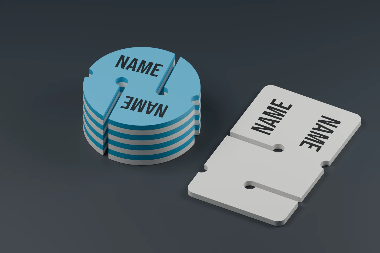
Choose flush for artwork on both faces and a flat stack of markers. Turn the preview over to see how the name reads from the reverse.
Raised colour sits on the body
The raised option uses the same 3 mm body with 0.6 mm of lettering and decoration added to the front. The colours print directly onto the body. There are no hidden mechanical anchors beneath the surrounding surface.
This finish makes the design more noticeable under a fingertip, but a name that is readable by eye may not be recognisable through gloves. It also adds thickness to a stack: check the fit in your marker holder.