Give the name enough contrast
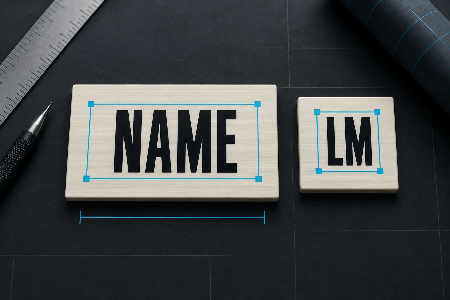
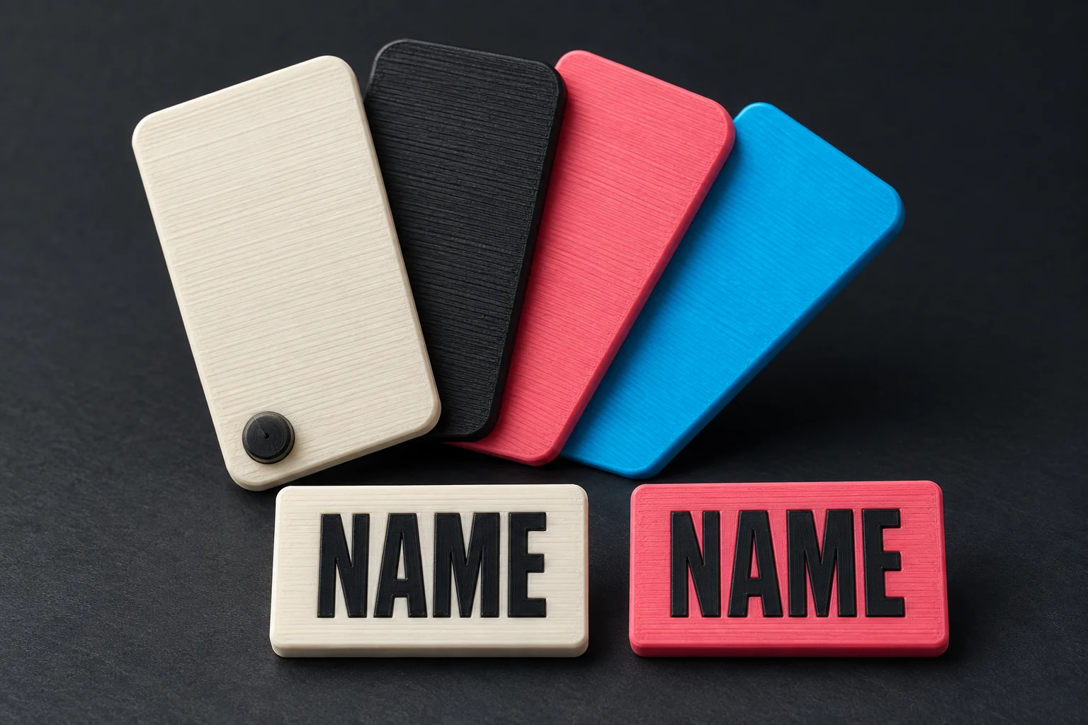
Start with the body and text. Black lettering on a white cookie is an easy combination to read; two similar mid-tones can look attractive in the palette but make the name disappear against the body.
On a playful marker, look at the surface directly behind the letters. The wine bottle’s name sits on its label, and the donut’s name sits on its frosting. Contrast with that colour matters more than contrast with the outside edge.
Two, three or four colours?
| Example | Where the colours go |
|---|---|
| Plain cookie, arrow or REM | Body plus text: two colours. |
| Wine bottle with a label | Bottle, label and lettering / details: three colours. |
| Mochi or donut | Body, dark details, accent and highlights: up to four colours. |
Your name uses the existing text colour, so adding it does not require another filament. You can also assign the same colour to more than one region. That simplifies the palette, but check that features such as the cheeks or sprinkles are still visible.
The screen is a guide to the combination
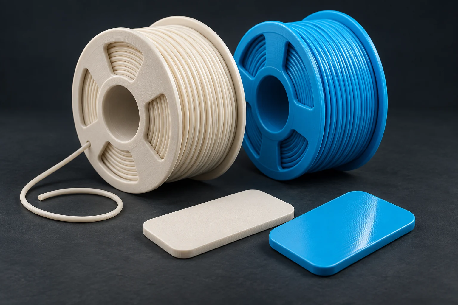
Select PLA matte or PETG first, then choose colours from that material’s range. The preview helps you compare contrast and placement. It cannot reproduce every filament’s finish or how a thin light colour looks over a darker body.
For the double-sided flush version, the colour details are 0.5 mm deep on each face. A very dark body behind a light detail can affect its appearance, so the photos of our actual prints are useful alongside the preview.
Keep the functional marker type recognisable when choosing a playful colour scheme. Our marker types guide explains where appearance and meaning meet.